User Interface
This page describes the basic user interface elements that are found in the ADOxx toolkits (Development Toolkit and Modelling Toolkit). Descriptions of more specialized user interface elements are covered on their separate pages.
Application Window
The following image shows an overview of the main application window and the default location of its parts: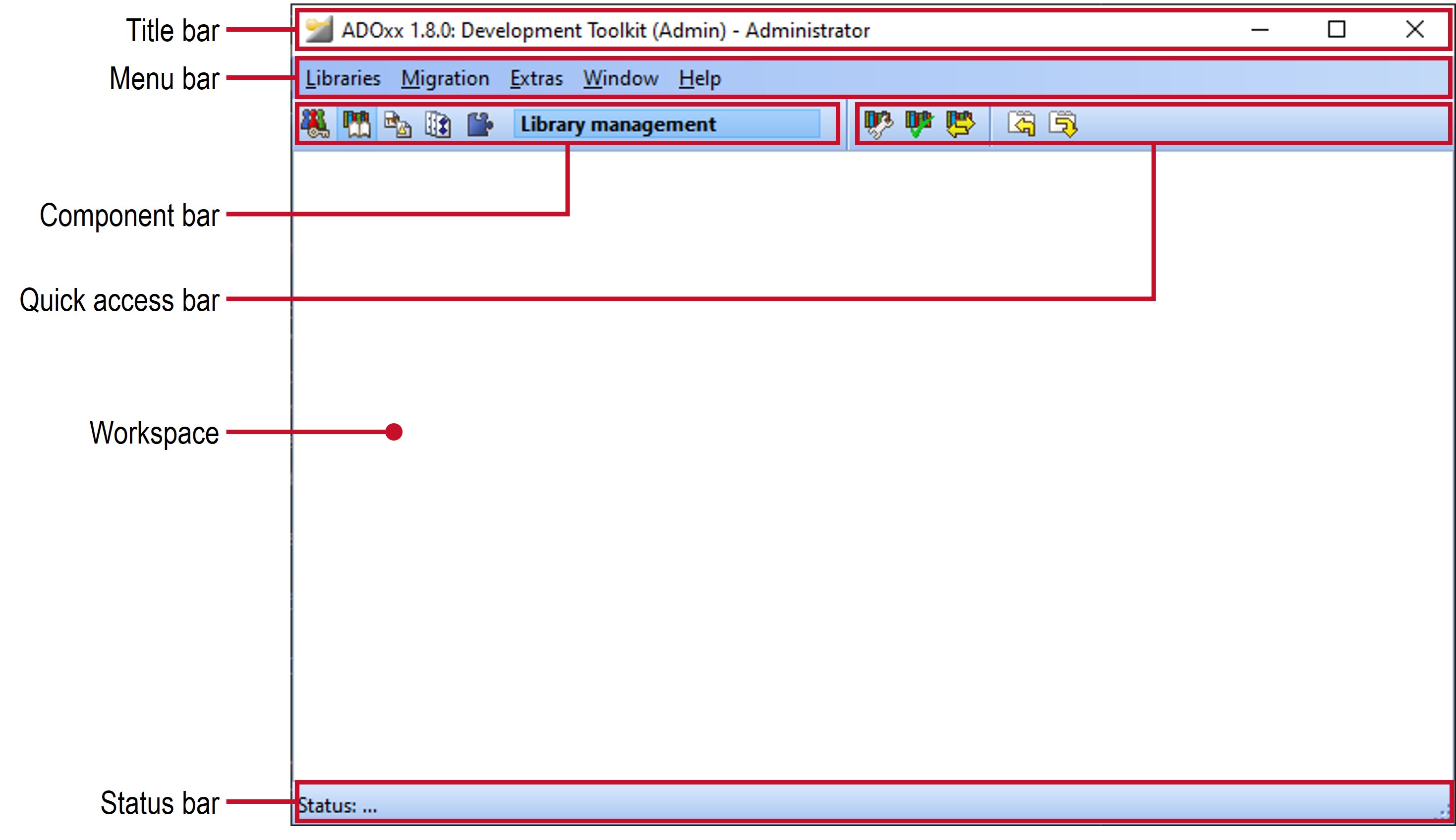
Other windows can be accessed through the various menus and buttons to perform specific tasks. These windows are either a part of the workspace (for example a model editor) or are presented as pop-up or dialog windows.
Title Bar

The title bar represents the header of the main window and consists of the system icon (small program symbol), the window title and buttons to minimize, maximize / restore or close the window. The window title contains information about the application and the logged in user in brackets. Additionally it can contain information about the currently active window of the workspace. Click the system icon or right-click the title bar to access to the system menu, which provides some basic functionalities of a window, like resizing, maximizing, closing etc.
Menu Bar
The menu bar allows to access various actions through its menus and their items. The available menus / menu items depend on the currently active component, which is selected through the component bar.
Component Bar

The component bar contains buttons to switch between the components, with the currently active component being spelled out in a field to the right of the buttons. Depending on what component is active the available entries in the menu bar and the quick access bar change.
The active component can also be switched by right-clicking the component bar and selecting the component from the pop-up menu. Alternatively you can select the F9 key to open the pop-up menu.
Quick Access Bar
The quick access bar offers buttons for quick access to frequently used actions. The actions are usually also available through the menu bar. The available buttons depend on the currently active component, which is selected through the component bar.
Workspace
The workspace provides an area for additional windows to perform various actions. It is mostly used in the Modelling Toolkit where the main content windows, like the "Start page" or any opened models, are placed in the workspace. The Development Toolkit mostly relies on dialog windows instead.
Status Bar
The status bar shows status information at the bottom of the application window.
Keyboard Shortcuts
Many parts of the application provide keyboard shortcuts to quickly perform actions. These usually consist of one or more modifier keys (Shift, Ctrl, Alt) together with another key. The exact keyboard shortcuts are typically written next to the item that triggers the action. For example selecting Alt + F4 will close the currently active window or exit the application in case of the application window.
Furthermore, access keys are provided for many labeled items to quickly select or navigate to them in the currently active window. These can be identified by the underlined letter of the label and are selected by holding down the Alt key and then pressing the corresponding access key. These can be also selected in a sequence when multiple levels are necessary to be navigated. For example when the main application window of the Development Toolkit is active then selecting Alt + l will open the Libraries menu and then selecting e will exit the application. If the access keys are not shown then selecting Alt will make them visible.
The following image shows both the keyboard shortcut for exiting the application as well as the access keys of several menus and menu items: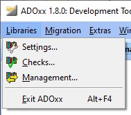
Context Menu
A context menu is available when dealing selectable items, like items in a list or objects in a model, as well as in some other cases. It is opened by right-clicking an item or several selected items. The actions provided through the context menu depend on the selected item(s). Some of the fairly common ones are described in the next section. The following image shows an example for the context menu when opened for an item of the Explorer in the Modelling Toolkit: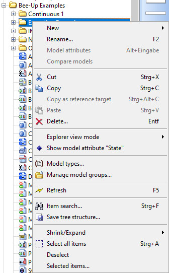
Common Actions
The following common actions and their respective icons can be found throughout ADOxx, for example as buttons, menu items or through the context menu:
| Icon | Name | Action |
|---|---|---|
| Cut (Ctrl + x) | Stores the selected items in the clipboard and removes them from the list. | |
| Copy (Ctrl + c) | Copies the selected items to the clipboard. | |
| Paste (Ctrl + v) | Pastes the content stored in the clipboard at the specific location. | |
| Delete (Delete) | Deletes the selected items. | |
| Refresh (F5) | Updates the list or view with the latest information available. | |
| Show all (Ctrl + Enter) | Expands all levels of the hierarchy to show all items. | |
| Hide all (Shift + Ctrl + Enter) | Shrinks all levels of the hierarchy to hide all items except for those on the highest level. | |
| Show selected (+) | Expands the selected item to show all directly contained items. | |
| Show selected with sublevels (*) | Expends the selected item to show all contained items including those on sub-levels (lower in the hierarchy). | |
| Shrink selected (-) | Shrinks the selected hierarchy level to hid its items. It is the same as clicking the symbol next to the item. | |
| Select all (Ctrl + a) | Selects all the selectable items. Items that are not shown in a list will not be selected, for example sub-items of shrunken items. | |
| Deselect | Discard the selection, leading to nothing being selected. | |
| Selected items | Shows a new window with a list of all selected items. |
The actions for shrinking and expanding the levels of a hierarchy are often located in the Shrink/Expand sub-menu.
Item Search
The ![]() Item search (Ctrl + f) allows to search for items in a list, displaying the Search items dialog window:
Item search (Ctrl + f) allows to search for items in a list, displaying the Search items dialog window: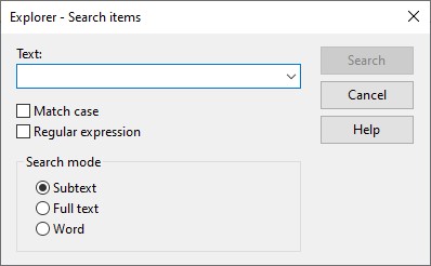
Enter the text for which you wish to search into the field Text or select an item already in the drop-down list. Simple wildcards can be used as part of the text (* for any number of characters, ? for exactly one character). The option Match case determines whether or not the actual case of the text (upper and lower case letters) for which you are searching should be taken into account. The option Regular expression allows to search for specific patterns using regular expressions, but disables the use of simple wildcards as regular expressions have their own syntax for wildcards. Additionally you can specify the type of search to carry out:
- Subtext: means that the text being searched for can be part of a larger word or sentence.
- Full text: searches for an entire piece of text, which matches the text for which you are searching.
- Word: assumes that the piece of text you are searching for is an entire word and will only locate matching words. A word must be a single grouping of text, flanked by blanks, a full-stop or the like.
The search is started by selecting Search. If entries matching the search criteria are found, then the search results will be displayed in a new dialog window. To change the selection of the originally searched list select any result in the result window and then select "OK".
Selecting in a List
To select or deselect multiple items in a list hold down Ctrl and click the items.
To select multiple items in a sequence select the first item, hold down Shift and select the last item.
To select all items in a list use the available ![]() Select all (Ctrl + a) action. Items that are not shown in a list will not be selected, for example sub-items of shrunken items.
Select all (Ctrl + a) action. Items that are not shown in a list will not be selected, for example sub-items of shrunken items.
User Settings
The user settings (F7) can be accessed via the menu Extras -> User settings to display a Notebook with the user settings. The following shows the user settings from the Development Toolkit: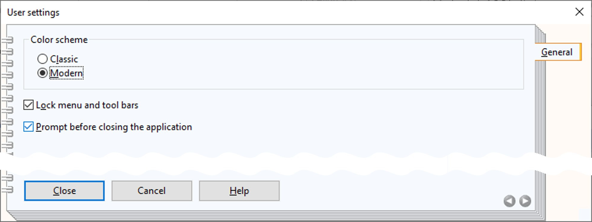
The general options provided in the Development Toolkit are:
- Switching the used the color scheme of ADOxx between Classic and Modern.
- Locking the menu and tool bars. If this is not selected, then these bars can be placed at a different spot or be floating separately.
- Prompt before closing the application. If this is selected, then a pop-up dialog has to be confirmed before exiting ADOxx.